Description
In PubCoder, everything you can place on a page is called an Object, from text and buttons to audio and videos. Every object can respond to events and be the target of some actions.
In PubCoder, objects are divided into three main categories: layout objects, widgets and controllers.
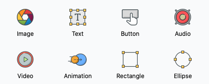
Layout objects are the most basic objects, that allow you to layout your page: Images, Text, Animations, Buttons, Audio, Videos and geometric forms like Rectangles and Ellipses.
Every layout object is visible to the user (unless manually disabled or hidden) and responds to every generic event and most generic actions, specifically the ones to change the appearance of an object, like moving, scaling or rotating it.
Objects on the stage can be double-clicked to edit their contents, while their properties can be edited from the selection inspector at the right of your project window. Being visible on the page, every layout object has a number of common generic properties that define its appearance and behavior.
Each specific layout object also has its specific properties and actions, see the various help pages for each layout object for more informations.
Generic Properties
Every layout object has a number of common generic properties that are listed below. To edit properties of an object, select it and use the selection inspector at the right of your project window.
| Include In | One between All Formats, No Formats or Some Formats. Selecting the last options will allow to select indivisual formats. Object will be completely skipped when exporting in a format in which it is not being included. This allows to exclude objects not compatible with a specific format and to use different objects for different formats. This property of course defaults to All Formats. |
| X | The horizontal pixels coordinate from the top-left of the page to the point of origin of the object (which usually is top-left too, but can be changed in the stage toolbar) |
| Y | The vertical pixels coordinate from the top-left of the page to the point of origin of the object (which usually is top-left too, but can be changed in the stage toolbar) |
| Width | The width of the object, in pixels |
| Height | The height of the object, in pixels |
| Rotation | The rotation angle of the object, in degrees, from -180° (counter-clockwise) to 180° (clockwise) |
| Hidden | If enabled, the object will be initially hidden to the user (can be shown later using the Show Object action) |
| Scrolling | One between Scroll with Page, Lock on Background or Lock on Foreground. Defines the positioning of the object on vertically-scrolling pages when the end user scrolls the page. Important: When using Lock on Background the object will not respond to touch/mouse events |
| Always Catch Events | If enabled, this object will always catch touches and clicks on it, blocking any behaviors and events that would come from forwarding the touch/click event to other objects below it |
| Opacity | A decimal value that defines object opacity, rangining from 1 (opaque) to 0 (transparent/invisible) |
| Effect | Defines the animation effect to be applied to the object, or None to display the object without any animation. Possible values are Fade In, Bounce In, Zoom In, Slide In and a lot more |
| Effect Duration | The duration of the applied animaiton Effect |
| Effect Repeat | The number of times that the animaiton Effect has to be played, use zero to loop the effect forever |
| Blend Mode | Defines the blending graphic effect to be applied. Possible values are normal, multiply, screen, overlay, darken, lighten, color dodge, color burn, difference, exclusion, hue, saturation, color, luminosity Important: Blend Mode is not supported on Internet Explorer (including PubCoder preview on Windows) and Android devices using Android 4.4 or earlier |
| Background Color | The background color of the container |
| Border | Enables or disables the border Important: The border is applied to the container object, so it will always be rectangular, even when applying it to a non-rectangular object like a transparent picture with alpha channel |
| Border ▹ Color | The color of the border |
| Border ▹ Thickness | The width of the border, in pixels |
| Border ▹ Corner Radius | The radius of the corners of the border, in pixels |
| Shadow | Enables or disabled the shadow Important: Shadow is not supported on older EPUB readers based on Internet Explorer (e.g. Adobe Digital Editions for Windows) |
| Shadow ▹ Color | The color of the shadow |
| Shadow ▹ Delta X | The amount of pixels to shift the shadow horizontally from the original object position |
| Shadow ▹ Delta Y | The amount of pixels to shift the shadow vertically from the original object position |
| Shadow ▹ Blur | Number that regulates the amount of blur to apply to the shadow |
| CSS Classes | List of CSS classes to apply to the container, divided by space or comma |
| CSS Styles | CSS inline styles, will be applied to the style attribute of the container |
Events
Objects trigger all Generic Events. To edit event handlers for an object, select it and use the Interactivity Panel on the right side of the project window.
Actions
Objects can be used as target of most Generic Actions, but some of them also provide specific actions, see the various help pages for each layout object for more informations.