Description
Displays a canvas where the end user can draw with his/her mouse or finger to color pictures and/or draw on an empty canvas. An editor allows you to define a palette of colors, a set of images to eventually include in the canvas, a set of markers, while properties in the selection inspector allow to define its appearance, such as canvas background and border, icons, tools and so on.
When option Autosave User Artwork is enabled, the last end user drawing will be automatically saved and later restored when re-opening the page.
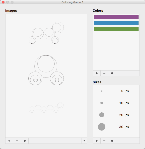
Double click on the coloring game placeholder on stage to open the coloring game editor:

On the left panel of the editor you can define a set images to be colored (just use the + and - buttons to add/remove images) and drag them to reorder. Please check out the section How to create a correct image for the Coloring Game for more informations about choosing/creating the right images. Just leave the list empty if you want end user to to draw on an empty canvas.
Use controls on the right side of the Coloring Game Editor to define a set colors and marker sizes (just use the + and - buttons to add/remove items) for end user to use when drawing.
How to create a correct image for the Coloring Game
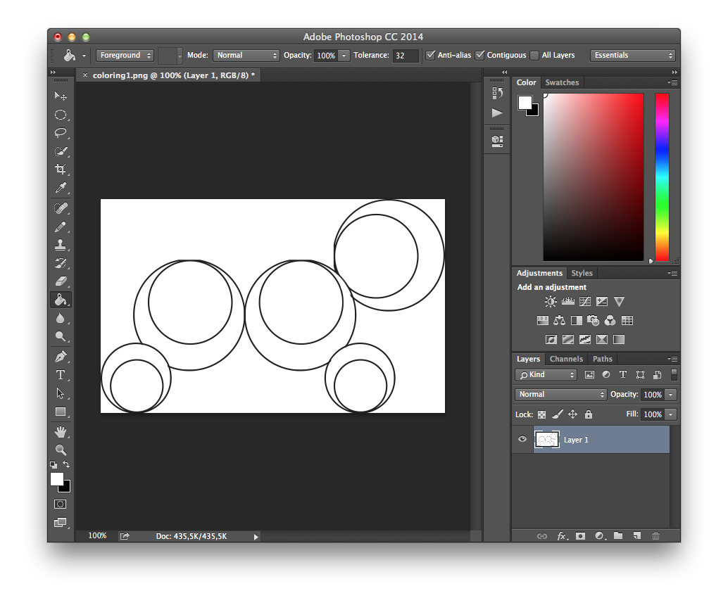
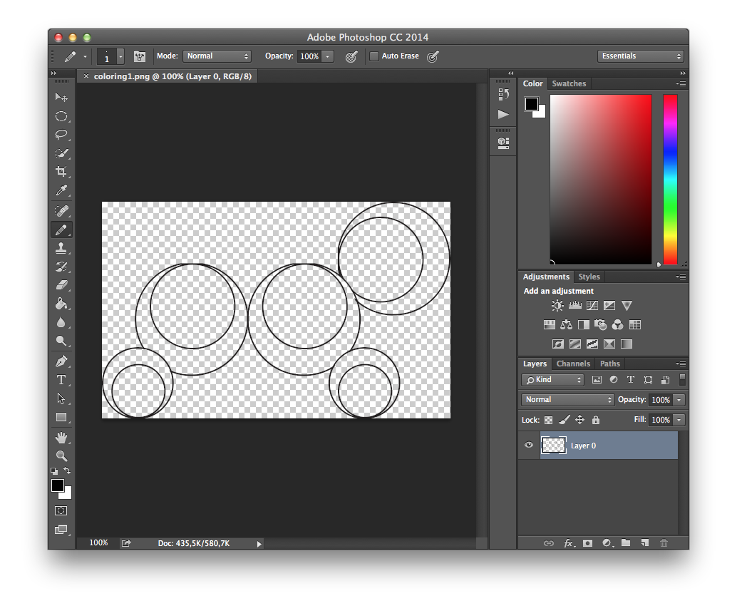
The coloring game widget allows the user to color a set of given images. When the user draws on the canvas using his finger or the mouse, it actually draws “under” the image. Thus, to make the widget work correctly and get the intended behaviour, you need a transparent image, saved in a format that supports transparency, e.g. PNG:
Wrong Image:

Correct Image:

Properties
Coloring Game widget supports most of the Generic Object Properties, plus the ones listed below. To edit properties of a Coloring Game widget, select it and use the selection inspector at the right of your project window.
| Images | Click to open the Coloring Game Editor to define images, colors and marker sizes |
| Canvas Background | The color of the background of the drawing area |
| Options ▹ Autosave User Artwork | When enabled, the last end user drawing will be saved and later restored when re-opening the page |
| Tools ▹ Marker | Enables the use of the marker tool for the end user |
| Tools ▹ Marker ▹ Icon | Defines a custom icon to use for the marker tool, leave empty to use the default one |
| Tools ▹ Crayon | Enables the use of the crayon tool for the end user |
| Tools ▹ Crayon ▹ Icon | Defines a custom icon to use for the crayon tool, leave empty to use the default one |
| Tools ▹ Filler | Enables the use of the filler (paint bucket) tool for the end user |
| Tools ▹ Filler ▹ Icon | Defines a custom icon to use for the filler tool, leave empty to use the default one |
| Tools ▹ Eraser | Enables the use of the eraser tool for the end user |
| Tools ▹ Eraser ▹ Icon | Defines a custom icon to use for the eraser tool, leave empty to use the default one |
| Tools ▹ Clear | Displays an icon that allows the end user to clear the canvas and restore the initial state |
| Tools ▹ Clear ▹ Icon | Defines a custom icon to use for the clear button, leave empty to use the default one |
| Tools ▹ Clear ▹ Confirmation Dialog Text | Defines the text that appears in the confirmation dialog before clearing the drawing |
| Tools ▹ Clear ▹ Erase Button Label | Defines the label of the button to clear the drawing in the confirmation dialog |
| Tools ▹ Clear ▹ Cancel Button Label | Defines the label of the button to cancel the clear the drawing in the confirmation dialog |
| Tools ▹ Undo/Redo | Enables undo/redo buttons |
| Tools ▹ Undo/Redo ▹ Undo Icon | Defines a custom icon to use for the undo button, leave empty to use the default one |
| Tools ▹ Undo/Redo ▹ Redo Icon | Defines a custom icon to use for the redo button, leave empty to use the default one |
| Show Controls | If disabled, all widget toolbars will be hidden and only the canvas will be visible and the user |
| Controls Background | Defines the background colors of the areas containing the end user controls |
| Toolbar Position | Defines the position of the toolbar in the coloring game between Top and Bottom |
| Toolbar Height | Defines the height, in pixels of the area containing tools, colors and marker sizes |
| Images Bar Height | Defines the height, in pixels of the area containing thumbnails of the images for the coloring game |
Events
Coloring Game widget triggers all Widget Events. To edit event handlers for a Coloring Game widget, select it and use the Interactivity Panel on the right side of the project window.
Actions
Coloring Game widget can be used as target of most Generic Actions, plus more actions that allow to change its state and build a completely custom interface using PubCoder actions:
Clear Coloring Game
Clears any drawings done by the end user on the canvas, restoring its initial state.
Properties
| Target | The Coloring Game to be cleared |
Set Coloring Game Image
Switches the current image on a Coloring Game
Properties
| Target | The Coloring Game to switch image to |
| Image Index | Index of the image to activate, in the same order as they are listed in the Coloring Game Editor |
Set Coloring Game Tool
Switches the current tool on a Coloring Game
Properties
| Target | The Coloring Game to switch tool to |
| Tool | One between Marker, Crayon, Filler, Eraser |
Set Coloring Game Tool Color
Switches the current drawing color on a Coloring Game
Properties
| Target | The Coloring Game to switch drawing color to |
| Color | The color to set |
Set Coloring Game Tool Size
Switches the marker size of a Coloring Game
Properties
| Target | The Coloring Game to switch marker size to |
| Size | Defines the size to set for the marker, in pixels |
