
Description
Displays an area that can contain multiple lines of styled text. Just double-click to enter inline editing mode and type directly on stage, or use the selection inspector to edit properties of the entire text box.
Text objects fully support writing also in right-to-left and non-alphabetic languages, read this article for more informations on this topic
Understanding HTML Text
PubCoder exports are based on web technology, thus text in PubCoder is HTML text.
HTML text is really powerful, but if you’ve experience using a word processing software like Microsoft Word, Apple Pages or even Google Docs, there are some important differences in how it works.
Basically, the main difference is that while text styling in traditional word processors is “flat”, in the sense that you can highlight some text and assign a style - as a combination of font, size and variations like bold or italic - and that’s it, in HTML text styling is based on Cascading Style Sheets (CSS), and for this reason styles are hierarchical.
Specifically, in PubCoder you can stylize text in at least 4 ways:
1. Define default text style for the entire project
Using the project inspector panel, at the right of your project window, you can specify default text font, size, line height and colors. These settings will be assigned to every text box in the various pages of the project, and can be of course be overridden by text-specific styles.
Here’s a list of Project Properties related to text, that you can find in the Writing Mode and Text and Colors sections of the project inspector:
| Writing Mode | One between Left to Right (default) and Right to Left use the latter to support right-to-left languages |
| Font | The defualt text font for your project |
| Size | The defualt text size for your project |
| Line Height | The defualt line height for text in your project, expressed as a relative decimal number: 1 means line height is exactly the vertical height of text, 1.5 means line height is one and a half rows of text and so on |
| Color | The defualt text color for your project |
| Links Color | The color to assign to links in text |
| Visited Links Color | The color to assign to visited links in text |
2. Define text style of a single text box
Using the selection inspector panel, at the right of your project window, you can define font, size, alignment, color and a lot of other properties for the entire text box. This is the best way to stylize your text in PubCoder, since the styles are assigned to the entire text box, and changing the text inside the box, either manually or via the Switch Text action, will retain those styles.
Text box style will override the default project settings (1), and will eventually be overridden by inline styles (3).
3. Inline styling
Double-clicking a text box will enter inline text editing mode, and display a toolbar full of controls to modify inline styling. Please use inline styling only when strictly necessary, as using it will actually insert style informations together with the text itself, so changing, either manually or via the Switch Text action, the text will not retain its styling.
The best way to use inline styling is by combining it with text box styling, for example you can define text font, size and color for the entire text box, then use inline styles to assign bold or italic variations or different colors to portions of your text.
4. CSS
If you know how to write CSS code, you can write it both at project and page levels using the Code Editor, then apply CSS classes to both the text box or inline text using the text editor, see the Code section to learn how to write Paragraph and Character styles in CSS that will be automatically detected by the text editor.
Using the Inline Text Editor
PubCoder inline text editor is a really powerful WYSIWYG (What You See Is What You Get) editor based on TinyMCE, which is the very same editor used by WordPress. Simply double-click a text object to enter the text editor: you can then type to see your text directly on-stage and apply styling using the text editor toolbar that will show on top of the stage:

Let’s see the functionalities of the various buttons in detail.
Undo/Redo

Allows to undo or redo the latest changes to text, with support for multiple undos.
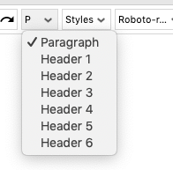
Section Type
Allow to select the type of section for the current selection, being a paragraph or an heading.
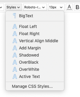
Paragraph and Character Styles
Allow to assign a paragraph or character styles of the selection. The list of styles is based on Paragrph and Character styles defined in Project Custom CSS Code.
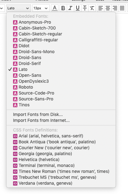
Font Menu
Allows to assign a Font to the current selection. See Fonts section for more informations.
Font Size
Allows to assign a text size to the current selection. A menu with some specific sizes in pixels is displayed, but you can assign a custom font size using whatever CSS-valid size definition - e.g. in pt, px, em, percentage - though using pixels size is strongly advises to avoid differences when displaying your publications in different browsers / readers.
Color and Emphasis

A set of buttons that allow to assign a color or emphasis - respectively bold, italic, underline, strikethrough - to the current text selection. The last button of the set allows to clear every style from the selection, going back to the project or text-box default style.
Lists
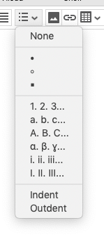
This menu allows to insert ordered or unordered lists in various styles, apply a different list style to the current selection or indent/outdent the current selection
Insert Image

Allows to insert an inline image in the text, or to modify the settings of the selected image.
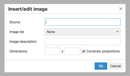
You can specify the source of the image manually (e.g. to reference an image online), or choose an image asset from the ones in your project.
Insert Link

Allows to add a link to the current selection or modify the link in the current selection.
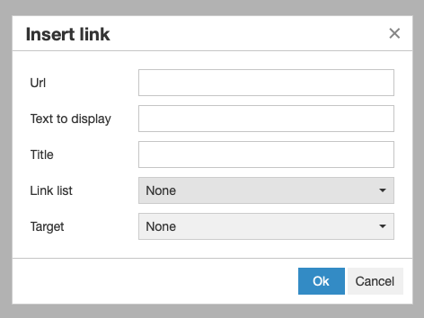
You can specify the URL of the link manually or use the Link List menu to select a page in your project as a destination. Doing this will result in PubCoder filling the Link field with a placeholder that will be resolved in a real link when you expory your project; this allows to link to real pages, and not their number: if you link to page 3 and then move that page so that it becomes page 4, the link will always point to that page, regardless of the page number (so it will point to page 4 in this example).
Insert Table

Allows to insert a table or modify table, row, column or cell settings for the current selection.
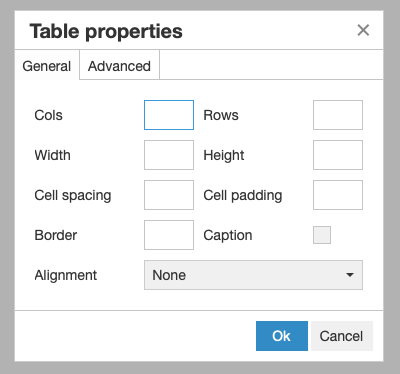
100% as the table widthLine Height

Allows to define the line height of the current selection, expressed as a relative decimal number (e.g. 1 means line height is exactly the vertical height of text, 1.5 means line height is one and a half rows of text and so on) or using a valid CSS line.height definition, like 20px.
Code Button

Click to display and edit HTML code for the text object directly using the Code Editor
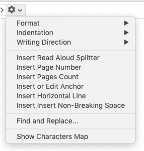
Additional Functionalities
The latest menu displays various additional functionalities, including defining the writing direction (left-to-right or right-to-left), using Find/Replace and insert special placeholders, like Read Aloud splitter, page number, pages count and others.
Fonts
When working with offline or print documents or publications, using a specific font simply means installing that font on your machine so that you can use it in the various applications. But with PubCoder, you will create publications that will be displayed on other users’ devices, so to ensure that your end users will be able to display your publication with the same font you see, you will need to embed the font in your publication.
For this reason, the Font Menu in PubCoder does not display fonts installed on your machine, but rather fonts embedded in your project. You can use the font menu to Import Fonts From Disk or Import Fonts From Internet.
After importing a font in your project, it will automatically appear in the Fonts menu and you will be able to use it throughout the software. The font menu also displays a “CSS Font Definitions” section, but we strongly advise to avoid using items in this section unless you have a deep undestanding of HTML and CSS.
Properties
Text object supports most of the Generic Object Properties, plus the ones listed below. To edit properties of a text object, select it and use the selection inspector at the right of your project window.
| CSS Styles (Inner) | CSS inline styles to be applied to the style attribute of the text container node (div.SCTextContainer, see Code section) |
| Inner Shadow | Enables or disabled an inner shadow, that will be displayed inside the text box, as opposed to the normal shadow that is displayed outside the object |
| Inner Shadow ▹ Color | The color of the inner shadow |
| Inner Shadow ▹ Delta X | The amount of pixels to shift the inner shadow horizontally from the original object position |
| Inner Shadow ▹ Delta Y | The amount of pixels to shift the inner shadow vertically from the original object position |
| Inner Shadow ▹ Spread | Number that regulates the size of the inner shadow: positive values will cause the shadow to expand and grow bigger, negative values will cause the shadow to shrink; Use 0 to use a inner shadow of the same size as the object |
| Inner Shadow ▹ Blur | Number that regulates the amount of blur to apply to the inner shadow |
| Text | The text content of the text object, click to enter Inline Text Editor mode |
| Text ▹ Code | Click to open the Code Editor to manually edit HTML content of the text object |
| Font | Defines the font of the entire text box. Use Default to stick to default one specified in the project properties |
| Size | Defines the font size of the entire text box. Clear any value to stick to default one specified in the project properties |
| Color | Defines the text color of the entire text box. Clear any value to stick to default one specified in the project properties |
| Text Shadow | Enable to apply a shadow to the text |
| Padding | Defines the space, in pixels, between the text contents and the text box bounds |
| Line Height | Defines the line height for entire text box, expressed as a relative decimal number: 1 means line height is exactly the vertical height of text, 1.5 means line height is one and a half rows of text and so on. Clear any value to stick to default one specified in the project properties |
| Letter Spacing | Allows to alter the space between the letters in your text, in pixels. Use positive values to increase the distance between letters, negative values bring letters closer |
| Columns | The number of columns for the text box. Defaults to 1 but you can use a positive value to make a multi-column text box |
| Columns Spacing | When using multiple columns for the text box, this defines the blank space that will be left to divide columns |
| Horizontal Alignment | One between Default, Left, Center, Right, Justify, defines how to align text horizontally. Default will use the correct alignment basing on the default Writing Direction defined in project properties |
| Vertical Alignment | One between Top, Middle, Bottom defines how to align text vertically. Will have no effect on scrollable text boxes |
| Selectable | If enabled, text can be selected (and copied) by the end user |
| Scrollable | If enabled, end user can scroll the text box, using mouse wheel on a desktop computer or swiping with a finger on a mobile device, to display text that does not fit the text box immediately |
Events
Text object triggers all Generic Events. To edit event handlers for a text object, select it and use the Interactivity Panel on the right side of the project window.
Actions
Text object can be used as target of most Generic Actions, plus:
Switch Text
Applies another text to the text object, using the original text box styling. A fade effect can be used as a transition while switching the text.
Properties
| Target | text object to switch text to |
| Text | new text to apply, click to open a text editor |
| Fade Duration | the duration of the fade effect, in seconds. Use 0 to switch the text without fade |